UNI illustration system
Creating an illustration style for a web platform
Introduction
The project was to develop an illustration style for a web platform - UNI.xyz which could be used throughout platform, in presentations, advertisements, etc.
Background
I started this project as a self challenge to unify visual language of entire platform and was involved throughout the development. I alone created the style but was guided by my mentors and critiques at various stages.
Case study
I began by looking up work of artists I admire for inspiration.

However, soon it became increasingly overwhelming to create a style of my own amidst that given the variety of option and already explored ideas. Thus, to narrow down my choices and understand what fits best for me, I broke down the style into smaller components to begin with. I identified 11 basic defining elements of any illustration style based on and by method of selective preference, landed on one that fits the purpose best.

Since the illustrations were meant for a web platform, apart from being communicative, aesthetically pleasing, they also had to be light weight (smaller file size) and should work on all screen sizes ranging from mobile phones to big desktop screens. Some of the technical requirements (and limitations) also played a key role in choosing a style. For instance, since we needed illustrations in SVG (Scalable Vector Graphics) format, the noise effect initially chose had to be removed as the SVG doesn’t natively supports that.
Direction
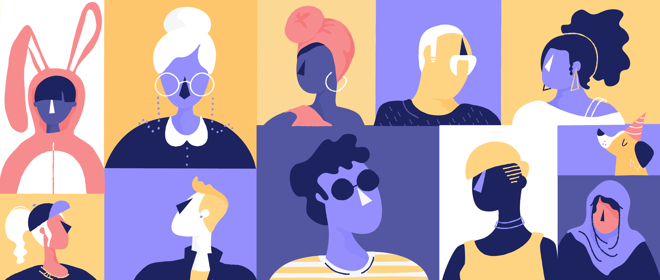
After much deliberation and experimentation, I decided to stick with a limited duo-tone color palette with line and blob type illustrations. The scale and proportions of characters were to be as per actual life and style was 2D in depiction.
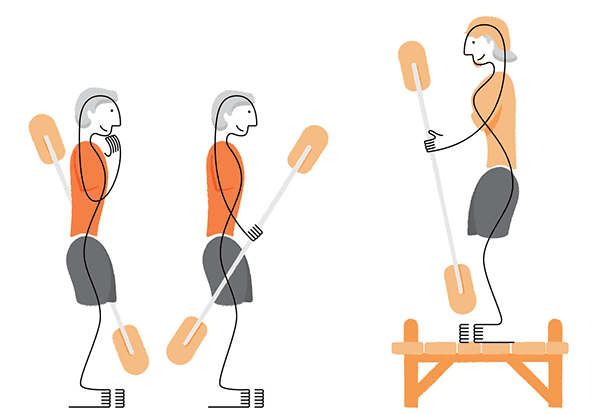
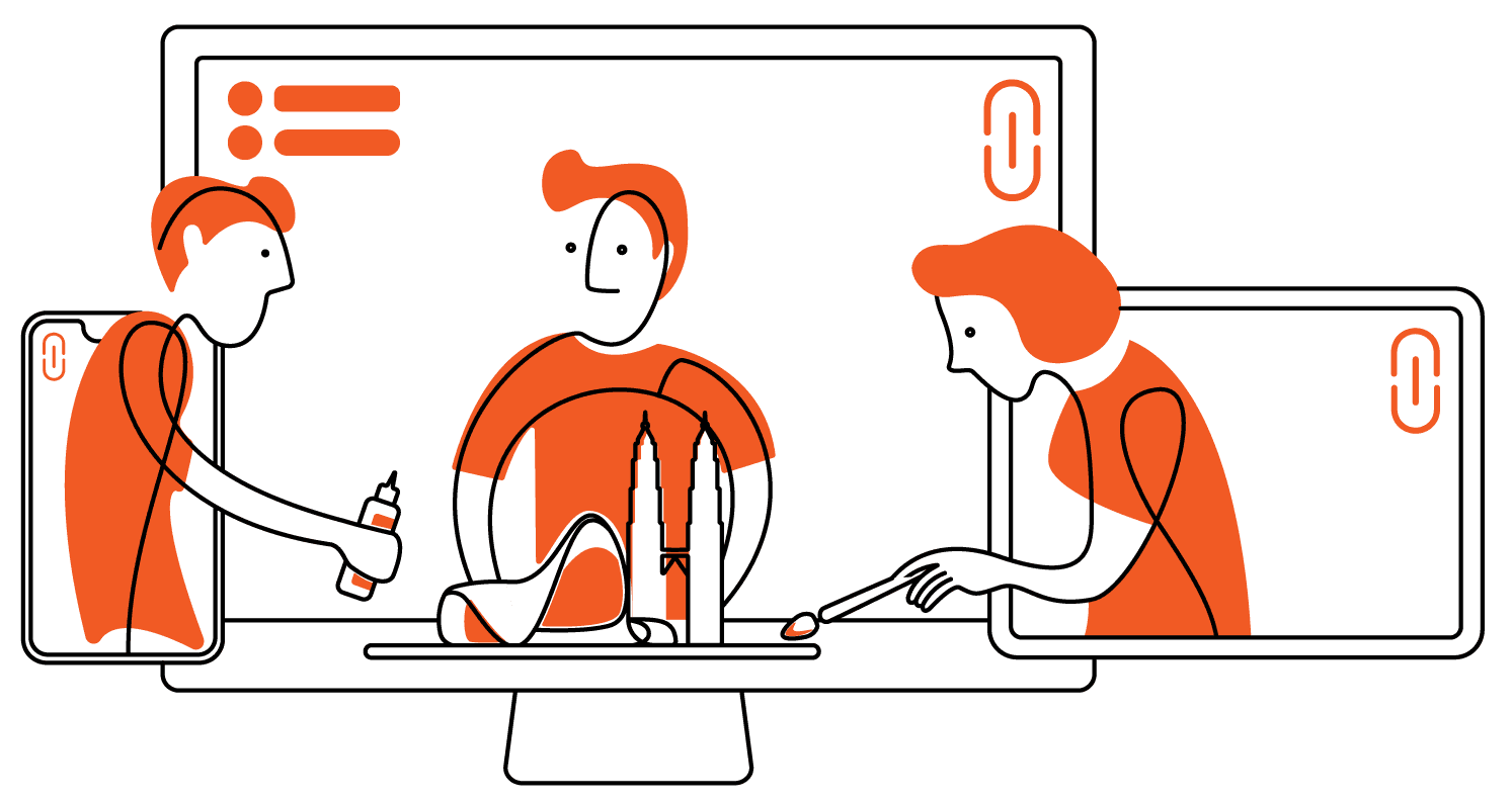
The initial idea was inspired from the video of Arctic Monkeys - Do I wanna know where all the depictions were done using a string.
I took that as a starting point and following a series of modifications, reached a level where we used a mixture of black lines and orange blobs to portray a scene.


Challenges
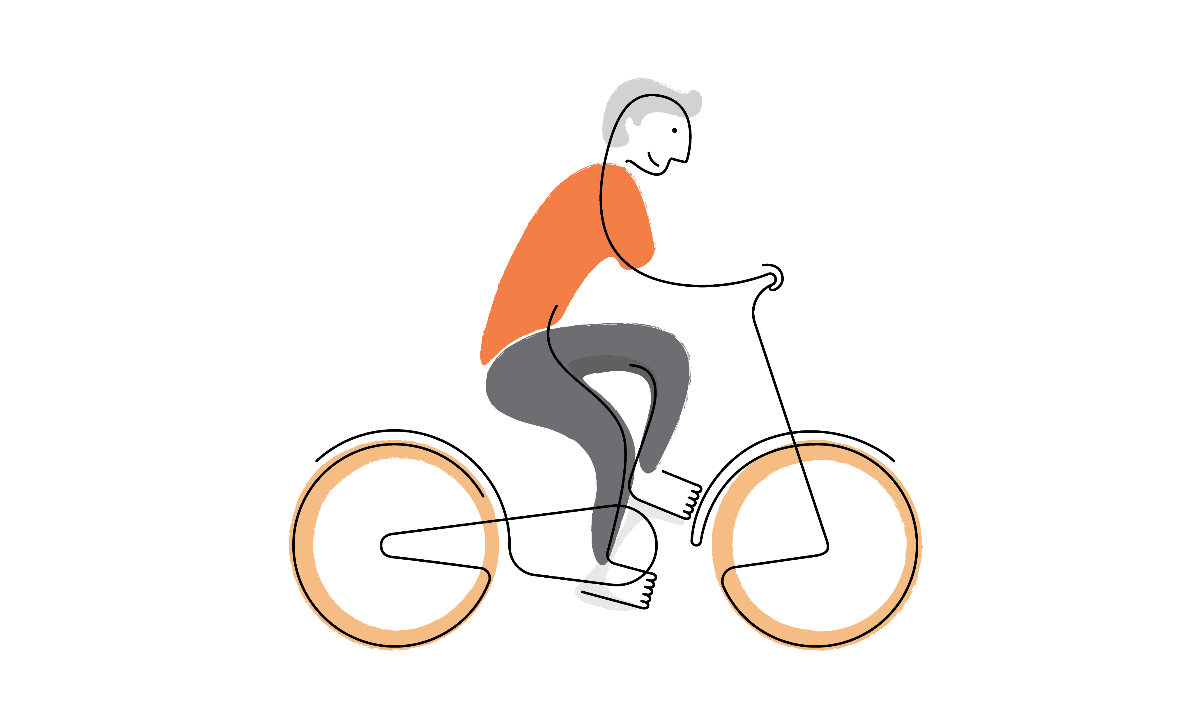
Although this style worked well for us and some of the illustrations I made back then are still used in our pitch slides, nonetheless there were several inconsistencies and color palette was too limiting. Thus I added few more shades of orange and grey to add depth in the illustrations


The challenge wasn’t just to design some illustrations, but it was to design a system of creating illustrations which could be adopted by anyone else as and when needed to create new additions in future while maintaining the consistency of the language
Process
Once I reached the end of my internship tenure, the project was put at halt. I resumed it upon joining as a full time designer upon completing my bachelors. By then, my understanding and view of illustration style evolved and the shortcomings started feeling more prominent.
So I decided to make some improvements to existing without starting from scratch. I experimented with colors which didn't work out as well as I expected. Then I experimented with line details and abstraction of some elements like hands and feet.

Final design
Finally, after many stages of trial and error, I landed upon design which seemed to check all boxes of my expectation.


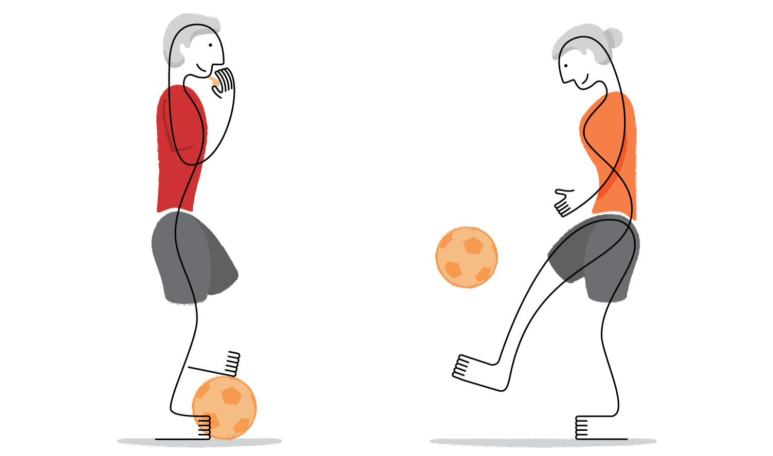
I also experimented creating themes within this style. For instance, illustrations below were using sports metaphors to communicate the ideas.