Product design · Web platform · UNI.xyz
Competitions @UNI
Re-Designing the experience for largest design competition organizing platform
- Project type
- B2C Web platform
- Duration
- June 2019 - April 2020
- Tools and skills
- Adobe Xd, Figma
- Client
- UNI.xyz
- Status
- Live
Overview
Introduction
UNI Design challenges started with an aim to provide designers a platform to grow and showcase their skills. Most of the challenges on the platform are based on pressing real world issues and attracts a large community of architects, urban designers & product designers. These challenges not only generate design solutions, but also help designers to evaluate their own skills at global level and learn from their competitors.
Context
Background
UX case study for a web platform organizing design competitions. Includes design audit, UX research, wireframing & hi-detail prototyping of competition catalogue and detail page.
Project history
UNI was established with an idea to provide designers with an opportunity to grow and showcase their skills through design competitions. Most of the competitions on the platform are based on pressing real-world issues and attracts a large community of architects, urban designers & product designers. These competitions not only generate design solutions but also help designers to evaluate their skills at a global level and learn from their competitors.
Initially at UNI, there was a separate website for nearly every competition we launched. It was only option back then given the limitation of resources. However, we knew we needed a single destination for all our competitions. So, during my internship period at UNI.xyz, I performed case studies of competition organizing & listing websites and was involved in preliminary discussions on what the portal should be like. We worked out a rough draft around the end of my internship. An year later when I joined as a full time UX Designer at the company, the portal was in place and had all the required functionality. However, there were certain aspects which needed fine tuning.
Task
Brief of this project was to enhance the existing competition portal in terms of design consistency, accessibility, affordance and aesthetics. The experience needed to be clutter free, linear, non-intrusive and suitable for designers of varying age-groups and experience levels.
Hypothesis
Being the landing page of platform, the portal reserved high importance from business point of view. The hypothesis was that enhancing interface experience would lead to visitor exploring more content which will improve conversion rates.
My role
As the sole designer in the team, my job was to improve and enhance the product without making major structural changes. My primarily objective was to improve design consistency, scalability, accessibility and aesthetics. I worked on integrating the portal with other sections of platform for seamless experience and curated visual assets like icons, illustrations and UI elements library. Apart from being the only designer in the team, I also subbed as PM for the most part overlooking team coordination.
Research
Audit
Since the portal was already in place, my process began with conducting a design audit. Although the user flow was very planned, there were several inconsistencies in UI due to lack of proper design guidelines. For instance, I came across a page where more than 9 types of font variations existed on a single page. Also, the catalogue design was such that it could only accommodate a small number of competitions at a time which soon became an issue.
Findings
I noted all those inconsistencies/ issues and in a reference document where proper use case and limitations of all interface elements were also listed (it later became the foundation of our platform design guidelines). Also since we weren’t looking to make major changes in overall structure and user flow of the existing portal, my audit was mostly confined to interface level issues.
Upon completing the audit, I presented my findings to the CEO of the company along with the development team. We discussed the future vision of the portal and worked out a plan for updates. We follow Google Material Design guidelines for the platform so I referred to its principles and guidelines as a reference.
Process
Approach
In this project, design interventions of varying scales were introduced in nearly all parts of the platform. Along the development journey, new challenges and opportunities came up which weren’t the part of initial planning but had to be incorporated. For the sake of simplicity, I have divided this case study into 2 parts — catalogue and competition detail page.
Challenges
The biggest challenge was to propose suggestions for improvements requiring minimal interventions. Since the team was working on multiple other products, it wasn't possible to allocate dedicated recourses for the project at that time. So changes were made on the go without impacting other deadlines.
Also, since this section was crucial from business pov, it was important to validate all assumptions before making an update
Process
This was a long project broken down into phases. We kept some time gap between any 2 phase to collect feedback and work on other projects. During the entire process, I was simultaneously working on improving our design guidelines which were evolving with each project. Thus the interface elements were also receiving regular updates.
Outcome
Final design
1) Catalogue
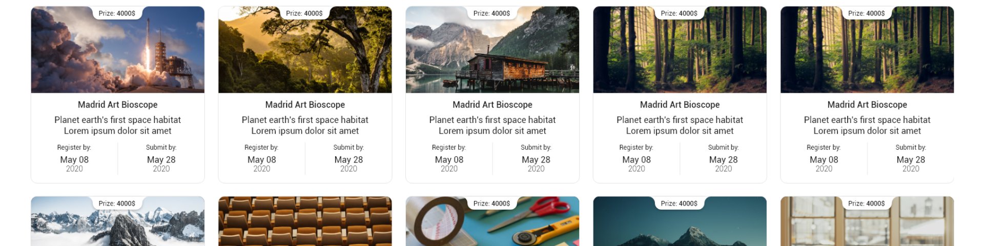
The catalogue is essentially the home page of the portal (and the landing page of the entire platform). It has the entire list of ongoing competitions displayed in cards format. Featured competitions are displayed in the carousel cover on top, following which there are various filters allowing users to find competitions matching their requirements.
Initially, the cards on the homepage contained a LOT of extra information about the competition. This abundance of information was too much to absorb for a reader and given the number of competitions we had, the text became overwhelming — not to mention the negative impact on surfing experience. Also, the seriousness of this issue magnified on mobile devices. We started by prioritizing the information that is important for participants thus removing the extra mess.
2) Competition detail page
It provides all the information a participant needs to know before participating and after the competition is commenced. Here, user can find relevant information divided into different sub-pages from a general overview, jury members, awards, fees & schedule and entries (once the result is declared).
Impact
The outcome was a refreshing and much-needed overhaul for the platform. Our entire team felt that the experience was much more polished. Although we made notable improvements in many aspects, I know there are still things left which have scope for improvements. As they say, the design is a journey and not a destination, that journey can sometimes take unexpected turns — we let our vision and user feedback define those turns for us. The platform is in a better position compared to what it was a year ago and we are in the testing phase for some serious changes to further improve what we have now.
Learnings
Being my first UX project, competitions on UNI was a great learning experience for me in all aspects. I understood the importance of process, the relevance of documenting decisions and developed a writing habit. Looking back at the plan of action we devised initially and way the actual project happened, I learnt that projects trajectory isn’t always predictable and the resilience with which the changes are embraced defines the success or failure. Every project poses unforeseen challenges along the way and its part of the process for a UX designer to respond to that and make suitable adjustments. I also understood that a UX project is much more than just serving user needs.